|
|
|
|
Home | Work | People | Client List | Download Portfolio
|
|
|
|
|
|
 |
|
|
|
|
|
|
|
 |
|
|
|
 |
|
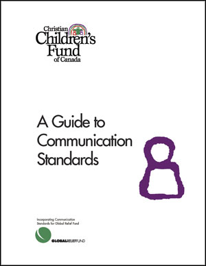
Christian Children’s Fund of Canada
Christian Children’s Fund of Canada is one of the country’s leading relief and development organizations, working with a focus on children through over 100 projects in 11 countries around the world.
When the CCFC needed to bring a fresh, contemporary and coherent look and tone to their communication materials, they turned to Wes Laing & Associates. The first step was a redesign of the organization’s corporate identity, including the development of a comprehensive set of corporate standards, followed by a series of brochures for the CCFC’s different programs, all featuring a clean, new design and informative but donor-friendly copy. |
|
|
|
|
|
|
 |
|
|
|
A Traditional Organization, an Un-Traditional Mark
Canadian Baptist Ministries
Canadian Baptist Ministries is a 125-year-old church-based organization involved in mission, relief and development around the world. They came to us for a new identity that would communicate something of their work, would be celebrative and would avoid the use of many of the traditional icons often seen in the identity programs of religious organizations.
The result was a colourful, three-dimensional mark that communicates a global orientation in a non-specific way. The four horizontal bands represent the four constituent groups that support CBM, but also suggest the waves of the world’s oceans and banners of celebration. The colours were chosen to be playful and celebrative.
The new mark has been enthusiastically received by the members of CBM’s constituency, many of whom take delight is seeing ever-new layers of meaning.
|
|
|
|
 |
A Solid Look—Mercer Insurance
Mercer Insurance was a well-established agency when they came to us. They were expanding their services into a variety of areas including financial planning, and were looking for a mark that communicated their multi-faceted approach to service but also a solid history.
We chose a monumental style of mark constructed around the company’s primary initial. The nine blocks reflect the nine basic areas in which the company offers services, and the blocks themselves are suggestive of “building blocks for the future.”
The mark was well-received by Mercer and by its clients.
|
|
|
|
|
|
 |
|
|
|
Lining Up New Business
AirTime Television Sales
Airtime is an agency that sells television advertising time for a consortium of independent stations. They required an identity that was fresh and progressive in a scene dominated by large network players.
Because name recognition was so important for this young company, we chose to develop a wordmark rather than a more classic logo. The mark uses strong horizontal lines to suggest a television image, and a dynamic slant on the type to convey energy.
Airtime was delighted with the new look. Along with advertising also developed by Wes Laing & Associates, it has played a key role in the company’s growing sales.
|
|
Home | Work | People | Client List | Download Portfolio
Advertising | Promotion | Education | Identity |
| Exhibit | Periodicals | Annual Reports
Wes Laing & Associates Inc. • 416-236-3737
Email
|
|
|
|
|
|
|
|
|
|
|
|
|
|
|
|
|
|